Chameleon A multi-branded design system for mx51
- Started
- June 2023
- Duration
- A year of planning and build, then ongoing support
- Squad
- 2 product designers, 3 front-end engineers, 1 delivery manager
- My role
- Design lead for the system
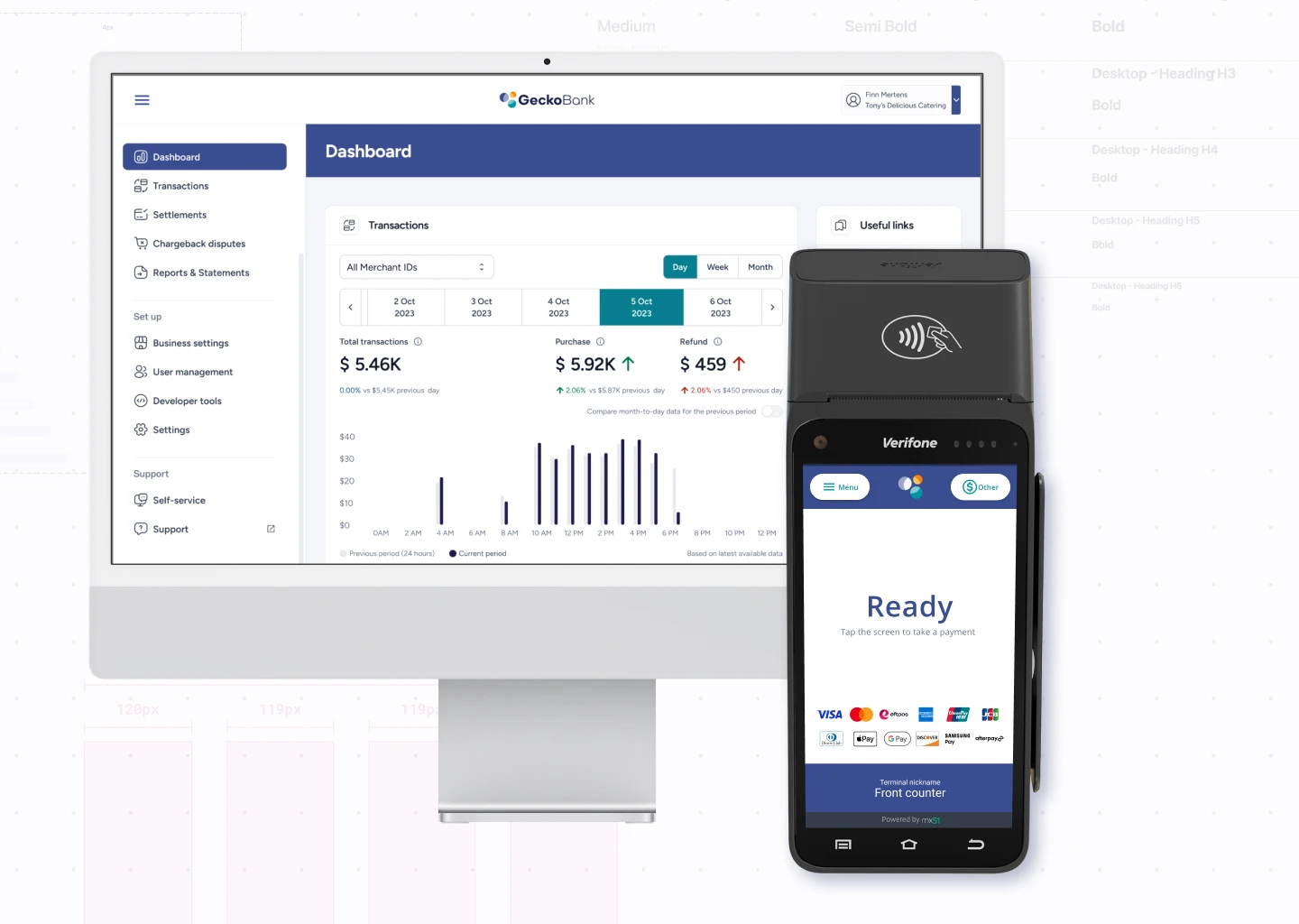
Chameleon is the design system mx51 uses to design, build and test dashboards and payment apps for some of Australia's major banks, POS partners and payment providers. It let a small team keep up with a fast-growing customer base without giving up consistency, accessibility or speed.
Impact the short version
- New tenant onboarding cut from two weeks to half a day
- One component library serving every brand, so features ship once
- WCAG 2.1 met by default across bank-grade products
- No more design-to-dev back and forth on the basics
The challenge: growth without drift
As mx51 took on major Australian banks and more than a hundred POS partners, the existing setup could not keep up. Each product had drifted into its own UI patterns, every new tenant meant hand-rebuilding screens in their colours, and bank-grade accessibility was being checked by hand at the end instead of built in.
The approach was two-fold: design everything once in a generic brand we called Gecko Bank, then swap the whole thing to any real brand through the system.
- Inconsistent designs across products
- High effort to onboard each new tenant
- Accessibility that had to hold to bank standards
- Slow, repetitive handoffs between design and engineering
Creating a new brand
half a day, down from two weeks- 1
Generate the palettes
Build the Alpha and Brand colour ramps for the new tenant.
- 2
Map the semantics
Point semantic colours at the palette and tune contrast. Set radius and spacing.
- 3
Swap the brand
Duplicate Gecko Bank, the generic brand, and apply the palette and tokens.
- 4
Publish
Publish the library, add the theme to the switcher plugin, and hand engineers the JSON from Tokens Studio.
The system
Chameleon became the single source of truth for design and development at mx51: design tokens, a UI component library, and documentation that engineers and designers both work from. Tenant branding is generated from tokens in minutes rather than rebuilt by hand.
- Consistency: unified components across every brand
- Efficiency: less time designing and building the same thing twice, faster releases
- Accessibility: WCAG 2.1 confidence built into the components
- Scalability: new tenant branding in minutes
What changed
Onboarding a tenant went from two weeks to half a day. Development time dropped noticeably, so updates and releases came faster. And the daily design-to-dev conversation shifted from pixels to product decisions, because the basics were already agreed.